My inherant need to be occasionally clever has found a safe outlet in the redesign of my home page. The previous design changes required me to update all the pages in my site - which was a pain. I'm using templates now and things should be quite a bit easier. Here are some of the older designs - these are just snapshots, so don't expect anything fancy.
|
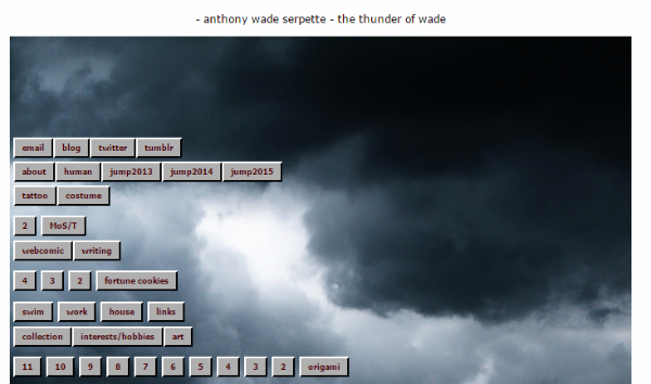
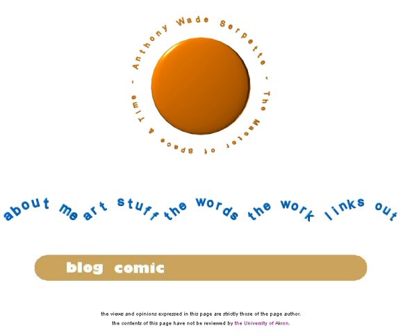
I liked the background image and used some simple CSS to make the buttons. |
|
This was done with css. Very simple and stark design - and very nimble. |
|
This is based off of my tattoo on my left wrist - the I Ching representation of "chen" or "exciting power". The roll-overs were one time only - starting off black and then appearing as red with the text. Bold, but maybe a little too intense. |
|
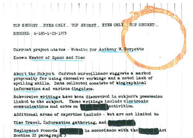
I found a typewriter font, then wrote up the text in Word. Added in the image of the coffee ring. Printed this out. Used marked to underline what would be my links, and used marker to 'redact' sections. I then printed it and carefully put it through the shreader. I then also carefully taped it back together and took it to work to scan, then slice up into the images for the links. It was very clever, but difficult even for me to find anything using the links. Nice idea, clever execution, but ultimately flawed. |
|
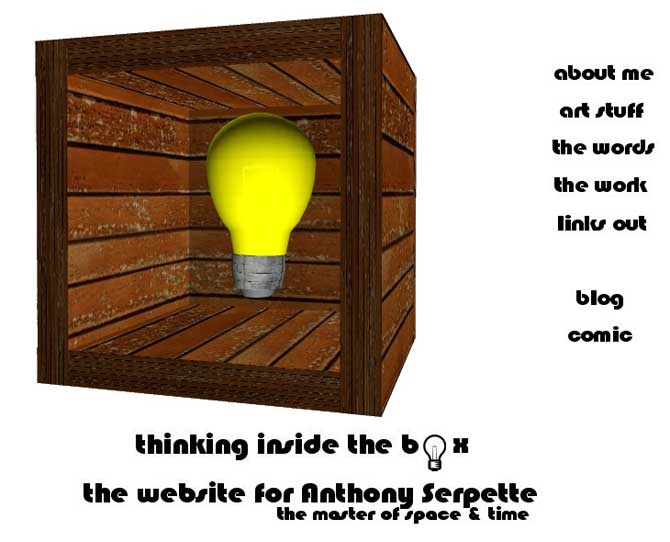
In the live version, the light blub would light up on a mouse-over, but it didn't go anywhere. The rest was an attempt to put a title or a theme on the site, but it was too clever and that never works for me. It was a good design for a while - simple and easy to use, but it was time for a change |
|
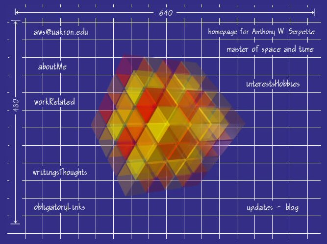
I went crazy with the animation on this one. The waves moved and the sunshine shifted around. Cool, but kinda limiting. |
|
This one never made it off the drawing board (ha!), but I still thought it was cool. I was a little concerned about having a dark blue background and white text for the rest of my site. |
|
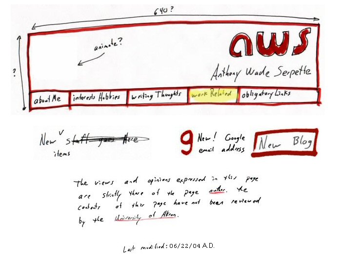
This one had some animation to it. The area labeled "animate?" had a lightning bolt and the roll-overs on the text looked like highlighter. It was kinda fun to sketch out what I wanted, then scan it and use it directly. I might try it again at some point. |
|
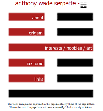
This lasted a long time and was a "fan favorite". Simple design, really, but interesting. The roll-overs will reverse the text colors. I also had a cool back button -which included the tattoo on my back. |
|
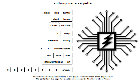
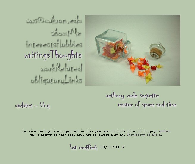
One of the first - and I used the same cool font for my business cards. Bauhaus 93, in case you were wondering. I used the animated lightning effect on this as well and the roll-overs did something as well that I can't quite remember. I think it was an indent. And the area for my name turned into Master of Space and Time on a roll-over. |